
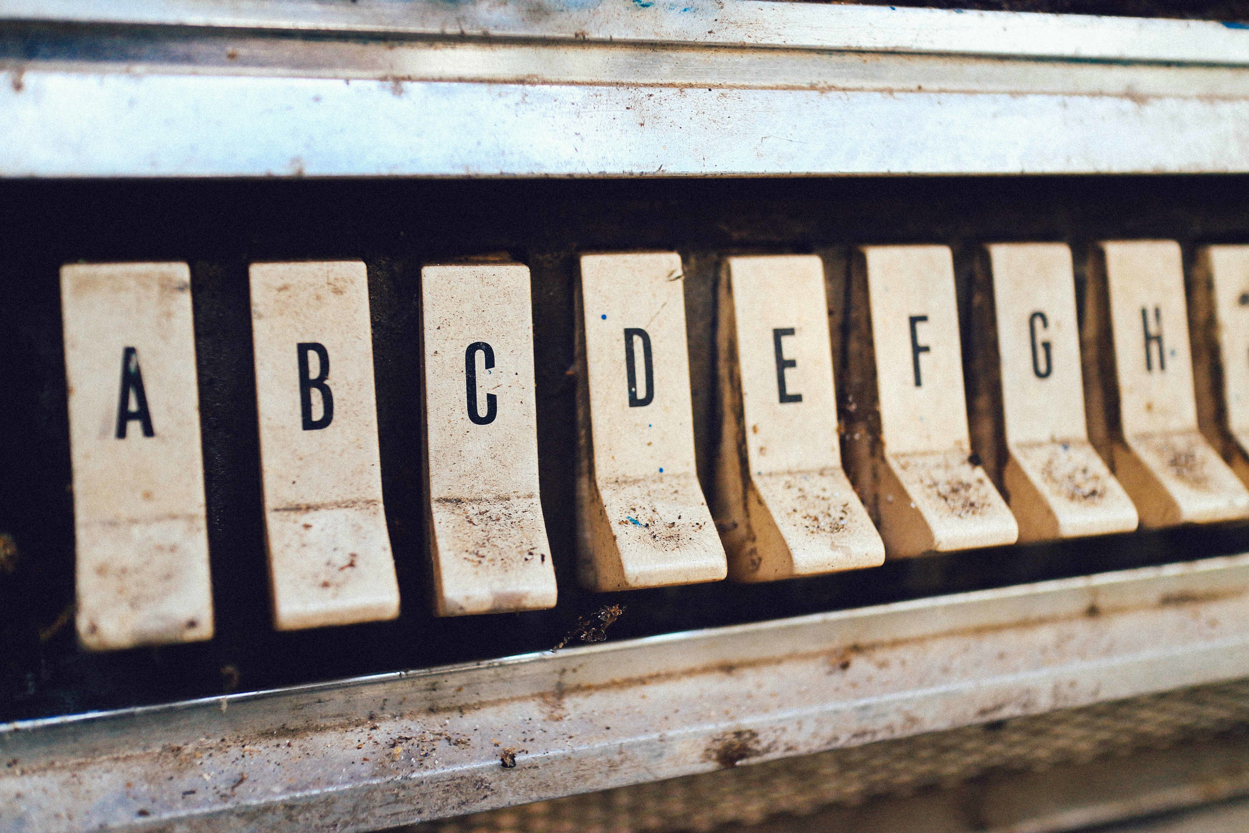
Why Typography Should Always Be One of Your Concerns
Diomari Madulara - Unsplash
"I don't really care about fonts. Just pick one." He said. So naturally, the urge to use Comic Sans or Windings came creeping up.
We were working on a new style guide and my colleague wanted to use the default MS Office font, to which, of course, I disagreed. Arial and Verdana are legible types, but they are also average. Did we want to be average?
The question on whether or not you want your communication to be average or legible is legitimate, but thankfully, not mutually exclusive. Fonts can serve as group identifiers and add to team spirit: in addition to using the same words, you also communicate in the same way or shape. However, even at Coca-Cola they don't put all of their communication in the iconic Coke font!
The Portal to All Knowledge
Ann Bessemans, graphic designer and researcher at the University of Hasselt, put it like this:
Letters are the gateway to knowledge. But the best reading font is the one you don't notice.
She used the metaphor of glass:
Even though lead glass is definitely a form of art, it does not give insight in to what's behind the glass. Lettering can be beautiful for the sake of lettering, but not for the sake of reading.
Why does this even matter to a learning consultant, you might ask?
The best reading font is the one you don't notice, or even: the one that makes reading easier, more comfortable.
When designing an e-learning, you will often be restricted to an organisational style guide. Put it under the looking glass: is this style guide easy to the eye? Does it convey the right message? Does the style guide hold into account esthethics, usability and efficiency? It might not always be possible to suggest pedagogical adaptions, but if there is such a space, do try!
This exercise is important as it may have an effect never accounted for!

Bouba & Kiki
Try the Bouba & Kiki effect. When looking at these forms; which one do you think is Bouba and which one is Kiki? This mapping effect of sound and shape was first observed by psychologist Köhler and has since many times been repeated.
An experiment with two types of pralines shows that the font on the wrapper has an effect on its attractiveness; when offered free choice, participants would always pick a certain wrapper first.
Good Typography has Immense Effects
Should I present you with a box of pushpins, a candle and matches. Would you be able to attach the candle to a wall without the risk of wax dripping to the floor?
According to an experiment; when the instruction is printed in good typography, not only will your creativity be sparked (and you'll be more likely to find the answer), you will also enjoy the task more (measured by underestimation of time passed).
Other than the more psychological effects, there are a multitude of tips & tricks on good typography to be found on the Internet. Try for example, this e-book of Articulate, or this crash course of Hubspot
E-learnings that thrive on text
It's not always possible to use sounds in e-learnings and other learning solutions. Written word can be an answer and then; Typography should be a concern to you. Especially when speed is key: choose a font that enhances letter recognition, that is comfortable to read and easy on the eye.
You might be surprised at the results!